Beading Market
Shop for beadwork made by your fellow beaders at the 3D-Beading.com Beading Market!
Welcome to the free software Gimp beadwork photo editing tutorial! You can download Gimp for free from gimp.org. If you have any difficulty following this tutorial, please post a comment at the bottom of the page on which you are stuck, and I'll do my best to help!
Things to know ...
I have no affiliation with the developers of Gimp. I merely stumbled upon their program through word of mouth.
This program is freeware and has no adware associated with it. We are very fortunate that the authors have generously provided this program to all for their free enjoyment. Download Gimp for free from gimp.org.
To explain the lingo, I will use double arrowheads ">>" to refer to a menu item, followed by a submenu item within that menu. (e.g. File >> Save, or Filter >> Enhance >> Sharpen)
Part I - Color Enhancement
1) Installing the program. Visit gimp.org to download the FREE full version of Gimp. I have no affiliation with the makers of Gimp, but it happens to be an amazing free image editing software and I highly recommend it for editing beadwork images. GIMP stands for GNU Image Manipulation Program (GNU is a free software foundation). It can be a bit complex and daunting, but with this step-by-step guide, we'll get through it together! The extra features are well worth it to make your beadwork pictures look that much more professional, and make the colors pop. Save the install file to your desktop and proceed with the simple installation.
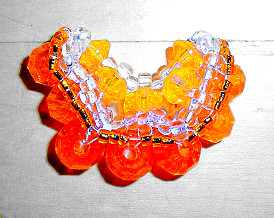
2) Open the program, by clicking the Start button and browsing for it in your list of programs, OR it may have placed a desktop shortcut on your desktop. Double click it to open the program. It will take about a minute to load because it's jam packed with amazing features. Once loaded, you will see two long vertical windows on either end of your screen (left and right). These are your control panels. Now we are going to open your beadwork image, in our case a picture of a beaded orange slice created by Jax (free pattern available on this site). To the left is the original picture so you can save it and open it in Gimp and follow along with exactly what we do to get the same result. The image is called orange.png. PNG is an image extension which stands for Portable Network Graphic (pronounced Ping). Gimp will open many different kinds of image types, including .JPG, another common image extension (stands for Joint Photographic Experts Group, the group that invented it, pronounced Jpeg). JPG, PNG, and GIF are the only image types that will be visible on a web page. We recommend you use PNG or JPG for your beadwork images, as GIF is far inferior in quality, a much older format. Right-mouse-click on the orange slice image, select "Save image as..." and save it to your computer, then open it in Gimp, by choosing File >> Open (from the left vertical window), and browse for your file.
3) Your image will open in a third window in the center of your screen, and this window has its own menu items (File, Edit, Select, View, Image, Layer, Colours, Tools, Dialogues, Filters). The window will also tell you the name of the file, the types of colours in it (RGB stands for Red Green Blue), the number of layers in the image, and the image dimensions (the beaded orange slice image is 400 pixels by 318 pixels). Pixels are the most common unit of measurement for pictures on computers because images on a computer are digital, and the computer knows how an image looks by keeping track of the colour value stored in each pixel. So images with more pixels per inch will be of better quality. Your screen resolution is also measured in pixels, for example 1280 by 800 pixels is my screen resolution (and this site looks pretty good so consider making yours the same!). At this resolution, I can fit 3 copies of the beaded orange slice image side by side, and have 80 pixels left over. You get the idea (hopefully).
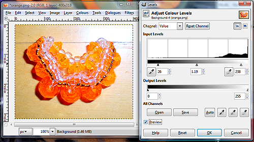
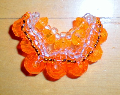
4) We're going to start editing the image's colour properties to hopefully enhance them. As you can see, the image consists of rather dull colours to begin with (or if you think it looks good now, just wait till we're through with it!). The first property we will enhance is called the Levels property. In the image window, go to Colours >> Levels. This will adjust the level of each colour in the image. Once the Levels window opens, do the following:
- Ensure that Channel: points to "Value" in the drop-down menu. This means that we are adjusting the overall colour levels in the image (mainly brightness-darkness and contrast).
- Ensure that "Preview" is checked at the bottom left of the window. This will ensure that you see the effects of everything you do, in the image window itself.
- Now all you have to do is drag the sliders back and forth. Don't touch the sliders under "Output Levels", only touch the sliders under the large graph under "Input Levels". As you drag the sliders, the numbers in the three little windows (by default, 0, 1, and 255) will change. Dragging the left slider towards the right will darken the shadows in your image. Dragging the right slider towards the left will lighten the highlights in the image. This together will enhance the colour contrast in your image. Dragging the middle slider to the left will darken the midtones of the image, while dragging it to the right will lighten the midtones (brighten the overall image).
When you are done, do NOT click OK yet. We're not done yet.
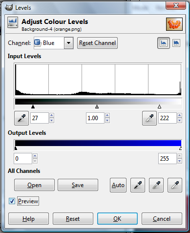
5) Now we will enhance the balance of colours within the image. Stay inside the Levels window. Under Channel, click on the drop down menu to select each individual colour, one at a time, and do the exact same thing you did with the overall image, except you will be balancing each colour, one at a time. My example shows you the blue channel. Now with this blue colour channel, for instance, the left of the Input Levels bar represents more yellow in the image, while the right represents more blue. The reason the left represents more yellow is because it represents the absence of blue, and yellow is the opposite colour from blue, so when you take out the blue, yellow remains. So dragging the left slider towards the right will enhance the yellows in the image, while dragging the right slider towards the left will enhance the blues in the photo. You can always do a bit of both to enhance the colour contrast in the image (the naturally yellower parts of the image will become more yellow, while the bluer parts of the image will become bluer). The opposite colour pairings under the Red channel are Cyan and Red, and for the Green channel, Magenta and Green. After you're done playing with all the channels, and satisfied with your job, click OK.
