
Beading Market
Shop for beadwork made by your fellow beaders at the 3D-Beading.com Beading Market!
Welcome to the Gimp beadwork photo editing tutorial! If you have any difficulty following this tutorial, please post a comment at the bottom of the page on which you are stuck, and I'll do my best to help!

6 A) We're done with Levels, now we're going to do an overall Colour Balance. Go to Colours >> Colour Balance, in the image window. In this window, we adjust ranges of colours, rather than one colour at a time, as with the Levels, which was more precise. The Colour Balance is more of an overall adjustment if an image is for instance overall too yellow. The adjustment is done in stages. First the midtones are adjusted, then the shadows, then the highlights. This allows more precision over the result. Ensure that "Preserve luminosity" and "Preview" are both selected. Preserve luminosity ensures that the current balance of shadows and highlights is preserved. You can always play around with not checking this. Preview allows you to see the effects of every action as it occurs. As you drag the sliders, the numbers on the right of the window beside "Red, Green, Blue" will change (they are all zero by default). Drag towards Cyan to reduce the Reds from the midtones, drag towards Magenta to decrease the Greens, drag towards Yellow to decrease the Blues, etc.
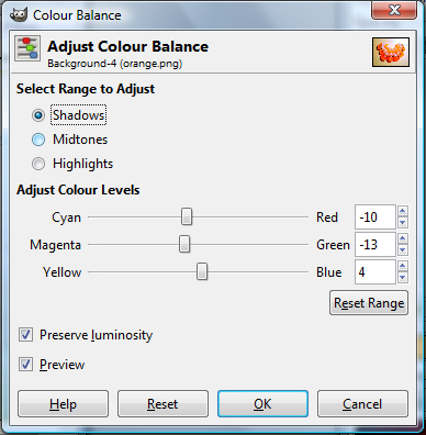
B) Repeat for shadows.
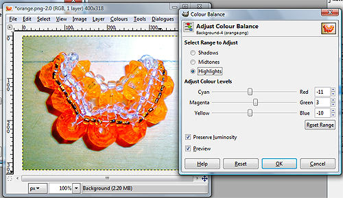
C) Repeat for highlights.
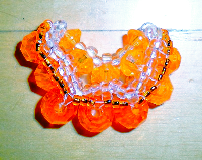
Progress: The fixed up orange so far. It looks much better, but I still wouldn't call this popping with colour or contrast. Here comes the really fun part.
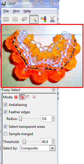
7) This will be our most precise step of all in the colour enhancement of our image. We will selectively enhance certain areas of the image, by first selecting those areas, then adjusting them individually. First, choose the Fuzzy Select Tool from the left vertical window (where the toolbox is). The Fuzzy Select tool looks like a magic wand with a yellow tip, or like a candle. It's the 4th tool on the top row. If that's not enough to convince you of where it is, the picture has it selected in a box. My red boxed image of the beaded orange slice is not supposed to be there, I just superimposed it to save space. Normally there would be more tools under there. Skip the red box for now, and have a look at the settings for the Fuzzy Select tool, shown at the bottom of the picture. Set the following (as shown):
- Mode: Choose the 2nd option (called Add to Selection), so that with each click of the Fuzzy Select tool on the image, you will add to your previous click rather than replace it. This allows you to quickly click in several places and select the whole area you are interested in colour editing.
- Check on anti-aliasing. This smoothens the edges of the selection.
- Check on feather edges. This very much smoothens the edges of the selection. It works by fading the edges of the selection with the surrounding pixels. The radius refers to how much blending do you want into the surrounding. For a smaller selection, choose a smaller radius or else the edges will be too blurred to figure out what was selected. For a small picture like the orange slice, I only chose to blend the outer 3 pixels of the selection (ie, radius of 3 pixels).
- It doesn't matter about checking "select transparent areas" because there are none in our picture. It was selected by default.
- To be honest, I don't know what "sample merged" means, but it's not selected, so I didn't select it. If you're daring, try it out for fun!
- Threshold: this is the most important feature of the Fuzzy Select tool. It tells the tool to be more or less precise in selecting pixels on the image. The Fuzzy Select tool works by selecting pixels of similar colour values that are contiguous (adjacent, ie touching each other), and the threshold value tells the computer whether you want a really narrow range of pixels or a broader range (for example, if the threshold is very low, eg. 1 to 10, and you click on a black pixel, you will only select black pixels all around the pixel you click on. But if your threshold is higher, eg. 30 to 50 or more, and you click on a black pixel, you will select a larger area around it, of perhaps brown pixels or dark red pixels). To start, select a higher threshold of 40 and click on a medium shade pixel in the area you are interested in selecting.
Now look at my selection in the red box. I only had to click 3 or 4 times in the area to make that selection, and it's pretty accurate and well blended. I'm going to use this selection to make the inner parts of the beaded orange slice more yellow.
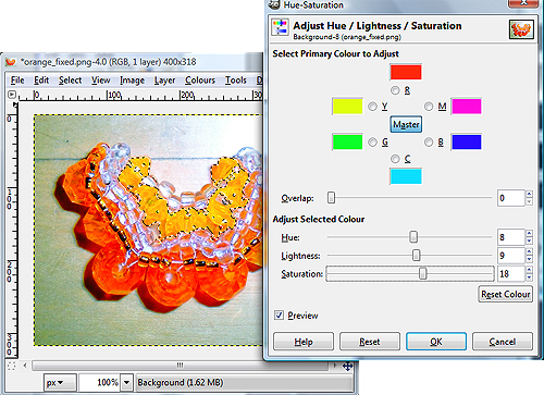
8) Adjusting the hues of the selection. With the selection still selected (from the Fuzzy Select tool), choose Colours >> Hue-Saturation, to bring up the menu shown in the picture. This window may look a bit confusing, but you won't be using all of it, just a few key parts. Do the following:
- Ensure that "master" is selected at the top (in the center between all the colours). We're only going to adjust the colours on the overall picture, it's not worth adjusting each shade of colour in the photo separately...even I'm not that much of a perfectionist!
- I don't know what "overlap" means, so I didn't touch it. If you're daring, go ahead and try it.
- Ensure that "preview" is checked, so you can see the effects of your actions on the picture.
- Now for the good part. Under "Adjust Selected Colour", you'll see three slider bars, Hue, Lightness, and Saturation. As you drag these sliders, the numbers in the boxes on the right will change (they are all zero by default). As you drag Hue, the shade of the colour in the selected area will change (eg, become more yellow or more red from orange, depending which direction you slide it). As you drag Lightness, the area will become either darker or lighter (right is light). As you drag Saturation, the area will become more or less vivid in colour. The more saturated the colour, the stronger and less muted the colour. Have fun!
- For the orange slice, I wanted the inner part of the orange to be more yellow, more vivid, and more bright/light. So I chose a value of 8 for hue, 9 for lightness, and 18 for saturation. Not huge changes, just subtle and natural.
When you are done editing the hues, click OK. The selection will still be selected, so to deselect it and see what your picture looks like now, choose Select >> None. This will remove the selection border. However, this makes your change permanent, unless of course you undo your action (go to Edit >> Undo, or if you are very adventurous, go to the right vertical window, and click on the yellow arrow icon, which is the history tab. Here you can reversibly go back and forth to any point in time in your editing process).
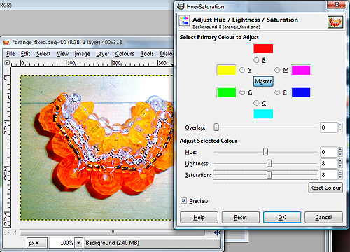
9) This is almost the same step as Step 8, except I'm showing you that I selected the white beads instead of the orange ones. I am brightening the white beads. Now I also recommend that you repeat this procedure for reddening the outer orange beads to add contrast with the inner lighter orange ones, and for making the background less saturated (more neutral gray, to contrast better with the orange and draw attention away from itself and towards the orange slice). The background is the easiest area to select because there is generally a high contrast with the object. In this case, the background will get a bit mixed up with the white in the white beads, so lower the threshold. And you can also choose the third option under Mode for the Fuzzy Select tool options, which is to Subtract from Selection, so that every time you click, whatever you click on gets removed from the selection, so you can polish yourselections by alternating with Add to Selection.
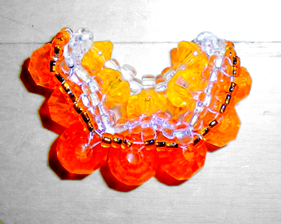
10) You're going to think I'm a crazy perfectionist, but if I teach you everything you can do, you'll be able to pick and choose what you like best. At this point in time, nearing the end of the colour editing, I like to go back into Levels and do some final touch ups. Choose Colours >> Levels and repeat the earlier procedure to adjust the brightness and contrast of the overall image, now that it has been edited so much. We're now done the colour enhancement process, and here's what the picture looks like so far. But we're not done yet, so turn to page 3 for how to sharpen the image.
| Beader Comments: | |||
| françoise on February 18, 2009: | |||
| desolée, je ne comprends pas tout |
